

Renovating an Ugly Duckling
| BY RICHARD McCLELLAN Renovating an ugly duckling The story of Meadow Glen of Richmond |
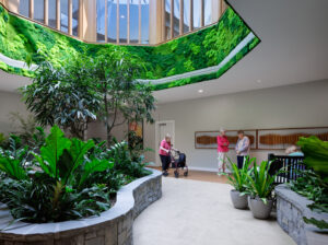
| I first heard about the property two years ago from a real estate professional in Richmond, Virginia, when I was inquiring about long-term care properties that were available in the area. The agent’s initial comment on this particular property was that it was “…almost new, had been opened and closed by the owner the year before, a very well-located property in the West End.” He added, “It doesn’t have too much curb appeal, and right now, it’s even difficult to get into the property because of road construction…with all of the road construction, you really have to want to go for a visit.” I thought that this high-profile location would surely be known to the entire community and not be a “secret” to the local long-term care industry. I put it on the “back burner” of possible purchases. However, having heard of the developer/owner in my inquiries around the state, I figured that the property likely had quite a story already. His reputation had been one that was typical of the long-term care industry in the 1990s: small operator/developer catches the development “bug,” like many others, and builds multiple facilities far ahead of his ability to deliver a good product. He runs into cash flow problems; the property and neighborhood suffer. Several months later I was again calling around the state looking for available properties in Virginia. This time, the agent mentioned that the property might become available soon. The owner had leased it to another operator-this time an underfunded one-and the business arrangement was not working out. The broker suggested that I should at least come down for a tour (and, he added, while I was in Richmond, the owner had a few other properties that could be acquired, too!). During my initial visit, I was impressed by the property’s excellent location, a nearly 10-acre parcel nestled in a wonderful wooded county park. There was certainly an immediate feeling of spaciousness for anyone driving into the parking lot. However, as I turned into the driveway, neither I nor anyone in our business of caring for families could have been prepared for the sheer starkness of it (figure 1). There was only a bare minimum of “landscaping” (if you could call it that). Several trees and dying shrubs were clustered in front of an H-shaped building configuration. Spotty areas of brown grass remained from a dry summer, and sod had never covered this ground in its almost three years of existence. Exterior lighting was at the lowest end of the cost spectrum, both by functionality and design/appeal. The first question one would ask in driving up to this building, I thought, was: What is it? Upon entering this building in its “before” condition, it felt like a C-quality office lobby. There was nothing to let you know that people were supposed to reside there. All of the walls were white, with a hideous dark green trim around the doors. Vinyl floors were used throughout, except for a light caramel-colored, difficult-to-keep-clean carpet in the common areas at the front of the building. Ceilings consisted of 2′ + 4′ lay-in acoustic tile with fluorescent lighting, again consistent with an inexpensive office look. The dining room was perhaps the most shocking (figure 2). In our industry, dining time is one of the most anticipated events of the day for residents-it must be a positive experience. Residents need a healthy diet and need to visit with their neighbors, and we need to see how well they are doing. The original entrance to the dining room was through one of two standard doors, again framed by that depressing dark green color. Two cheap ceiling fans adorned the center of the room, while several unattractive hanging light fixtures added their paltry contribution of light to a room that, thankfully, already enjoyed natural light from many windows along two sides. An inexpensive, decorative gas fireplace was stuck against a small wall, hiding the cafeteria-style serving window in the kitchen. However, it was the institutional gray vinyl floor that provided the dominant impact on the visitor. While the four-place tables were fine, the chairs were about as comfortable as the worst chairs in a doctor’s waiting room. I felt as though I was standing in a really bad school cafeteria (although, surprisingly, the kitchen area was more than adequate). To the left and right of the dining room were large mirror-image living/day rooms, each providing views of the front and rear of the building through more than ample window walls; the only problem was there was nothing to look at outside. The sparse furniture in the living room was bland, was not very welcoming and, not surprisingly, turned out to have been rented. At the rear of the building, each room had a large covered porch. Sitting on those concrete slab porches, one had the potential to enjoy the natural wooded setting in the distance-a potential that was ruined by another interceding swath of brown grass. The residents’ suites comprised the outside legs of the H-shaped building. Each suite had the same institutional vinyl floors, whitewashed walls, 2′ + 4′ lay-in acoustic tile ceilings with fluorescent lighting, and green-trimmed suite entrance doors. Inside the room, the large living area was designed for two “patients,” as indicated on some old plans that I was given. It was obviously set up for two beds because along one wall were two covered, wall-mounted fluorescent lights, with the typical nurse pull cords that we have all used in hospitals. The closet and windows were fine from a functional standpoint but, again, predictably stark. While the bathrooms were a good size, they lacked any sort of aesthetic appeal; but at least they were functional. A nursing station was located in the middle of each of the two resident wings, providing a good, strategic location for that most-needed purpose, whether for a nursing home, as this property felt like, or-with a big stretch of the imagination-an assisted living residence. Now I knew why this property had only one resident occupant at the time and why no one had wanted to put the owner out of his misery. “It’s just too challenging,” was, I’m sure, the opinion of many who had toured this facility. Actually, I was thinking pretty much the same thing as we finished the initial tour. All I had to do to make all this work was to add ample sums of money and a business plan that worked. As I was shown other properties, though, I just could not forget the great setting of this property, the wonderful established neighborhood around it, the potential. Yes, but…how? Taking our design and construction team on a follow-up tour a few days later, we started to flesh out the great possibilities for this facility to match its excellent location. However, since we are not in the museum business, renovation had to be done within the context of market demands. What impact would the upgrade have on value? Just how much would it cost to achieve the vision? And the ultimate question: Could we afford it? With the aid of our helpful lender, Community Bank of Northern Virginia, I decided to move ahead cautiously. My initially planned renovation program was upgraded by a factor of two during the first several weeks of our study, as we became more comfortable with the property and its unique location and park-like setting. We concluded that the surrounding West End community demanded the highest quality assisted living residence and, importantly, would financially support the needed upgrades. The Renovation Inside, our interior designer-my wife Barb, as it happens, president of Bibelot Interiors-went through much of the building, including the resident suites, with new carpet; a darker, more attractive shade of green (quite similar to our first Meadow Glen of Leesburg [Leesburg, Virgina]-see Design Center, October 2002). The 2′ + 4′ acoustic ceiling tile was replaced with attractive 2′ + 2′ architectural-style tile, new lighting replaced the fluorescent lights, and new wall sconces were added to the corridor walls. The walls were painted throughout, except in common areas like the dining rooms, where wallcoverings were used, as well. Although almost the entire building was renovated, a few major areas are worth focusing upon. Dining room. We opened up the front wall to create a more dramatic, yet welcoming, entrance. Two glass doors with sidelights now allow a view of the dining room in the background as one enters the building. Through these double doors, one’s eyes are drawn to the two decorative chandeliers that replaced the pedestrian hanging fans and light fixtures, and to the newly expanded and decorated wall in front of the kitchen. That wall was doubled in width, and the fireplace removed and replaced with a large sideboard with framed pictures above, adding to the warmth of the room. The large size of the room was softened in scale by adding a chair rail with a dark red tone on the bottom half. Large storage closets were installed on either side of the entrance, with end walls that are angled as one enters the dining room (a facility can never have enough storage space.) Lush window treatments on both side walls enhance the feeling of an elegant dining space. Outside, we added courtyards extending beyond the covered porches, with trees, flowers, and a patio for residents to enjoy viewing as they dined. Living rooms. The two living room areas were redefined by function and totally redecorated accordingly. One became a comfortable and inviting library, with two distinct sitting areas, each separated by enough space for privacy (figure 3). The other room is an informal, fun recreational space decorated with a tropical flair. It has a large-screen TV, two game tables, and nice sitting areas. Porches. Each living room opens onto a large covered porch that is furnished with inviting wicker furniture. The concrete slabs were faux-painted; for example, the one off the informal media/game room resembles local brownstone. That porch also was screened and has become a popular place for residents to spend long afternoons and early evenings. The other porch was faux-painted in the gray tones of flagstone (figure 4), again with similar wicker furniture, but in this case the porch was left open to the new adjacent courtyard. Beauty parlor. This space was transformed into a much more exciting room-a “total makeover”-with black-and-white photos of popular Hollywood actresses of the 1940s adorning the walls and the use of complimentary colors to make hair styling a fun experience (figure 5). This has proven to be a very popular locale for residents several times a week. Private dining. Our inspiration for this space came from the first Meadow Glen in Leesburg. There, an old farmhouse was preserved, including the original dining room, which was set aside for families to use for birthdays or other private occasions. In this facility, we took an unused interior room, gutted it, and re-created an attractive dining/meeting space that is reminiscent of nearby Williamsburg (figure 6). Conclusion Historically, this is the third opening of this residence. Is the third time the charm, as the old saying goes? We think it is. |
|
|
|
|
|
|
| Richard McClellan is managing partner of Meadow Glen of Richmond. For further information, phone (703) 404-2546 or visit www.meadowglen.net. For more information on Bibelot Interiors, e-mail BibelotInc@aol.com. To comment on this article, please send e-mail to mcclellan0904@nursinghomesmagazine.com. For reprints in quantities of 100 or more, call (866) 377-6454. |
Related Articles


Topics: Articles , Design , Housing